Apptio - Cloud Financial Planning Dashboard
Data Entry, Review, and Management Experiences
UX Architecture
Usability Testing
Pete Goubert (PM)
3 Engineers
(May-Aug. 2022)
Miro
About
Apptio Cloud Financial Planning (CFP) allows various roles to work on the dashboard together to plan and fine-tune the cloud finance data. It aimed to integrate an existing finance planning product into another Cloud product.
My Role
I led the mvp redesign and integration and reported to the Design Lead Nigel Wolters, while collaborating closely with PM and Devs and presenting to stakeholders.
Impact
In the end, I successfully handed over the mvp design to Devs and contributed to the pre-launch product demo at the TBM Conference in Nov 2022.


Problem
Poor user efficiency in both the collaboration and the management experience
- • (IT Ops and Devs) Need to navigate through various pages to track data updates, approve changes, and give feedback
- • (IT Ops and Devs) The data table UI is bad for locating and editing
- • (Admins) Need to navigate through various pages to setup a new plans
Solutions
I Redesigned the prototypes flows and the UI, and speeded up user efficiency by:
- • rendering across-page content into clickable table columns, drop-downs, and models
- • reorganizing related functions together
- • adding the highlights to provide visual hierarchies
1. speed up Data collaboration (Submit and approve)


2. Speed up plan Management

See before and after comparison:
1. What is CFP?
Apptio is the leading provider of technology business management (TBM) applications. After the acquisition of Cloudability, Inc., Apptio decided to integrate IT Planning (ITP) into Cloudability as an add-on, Cloud Financial Planning (CFP), to provide advanced cloud spend planning services for paid users. It allows companies to create cloud spending forecasts guided by an AI-powered forecasting model that analyzes new or modified cost drivers.
The requirement is to redesign and integrate the data collaboration and plan management (MVP) into CFP.
2. Who are the users?
During 3 weeks of onboarding, I read 4 user research reports and 2 product pitch presentations to understand the users and their goals.

3. What do stakeholders complain?
In the first 2 kicking off meetings with our stakeholders, we discussed their pain points with the original product.

4. What is the Challenge?

Since CFP will be provided as an add-on to paid Cloudability users
➡️ we need to merge 9 pages into 1 page
How might we integrate CFP
1. with more efficient submitted data collaboration and plan management experiences
2. under limited number of pages
What caused the pain points? By exploring the previous design, I aimed to look for the true reasons behind the stakeholders' complaints.
Pain Point 1: navigate various pages to complete 1 task


Pain Point 2: scroll a long time to see the data they care about
When user land on this page, they can't see the information they care about right away
Ops and Devs care about the lines they collaborated on, and Admins care about the general finance performance

In the workshop with PM and the Design Lead Nigel, we remapped the user flow to optimize how they participate in the plan opening and data submitting processes.
In this step, I aimed to look for opportunities to regroup the page content by user task flows but not the function types.

In the next step, I modeled the corresponding functions into the information architecture, and iterated several rounds after presenting to the Design Lead and PM.

Given the very limited number of pages
🤔 how to fit all in here?

By regrouping similar functions according to (1)the end users and (2)the task flows, we simplified 9 ITP pages into 2 major pages, 4 tab pages, and 7 modals.
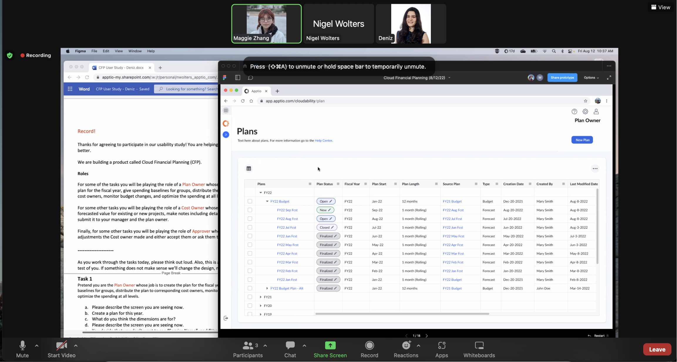
In the duration of 10 weeks, I developed 20+ versions of prototypes and brought them into 17 CFP team meetings and 4 customer meetings.
Discussion 1: Table view
* Click the images to read the details

Discussion 2: Permission assignment
* Click the images to read the details

Discussion 3: Plan Status and Shareout
* Click the images to read the details

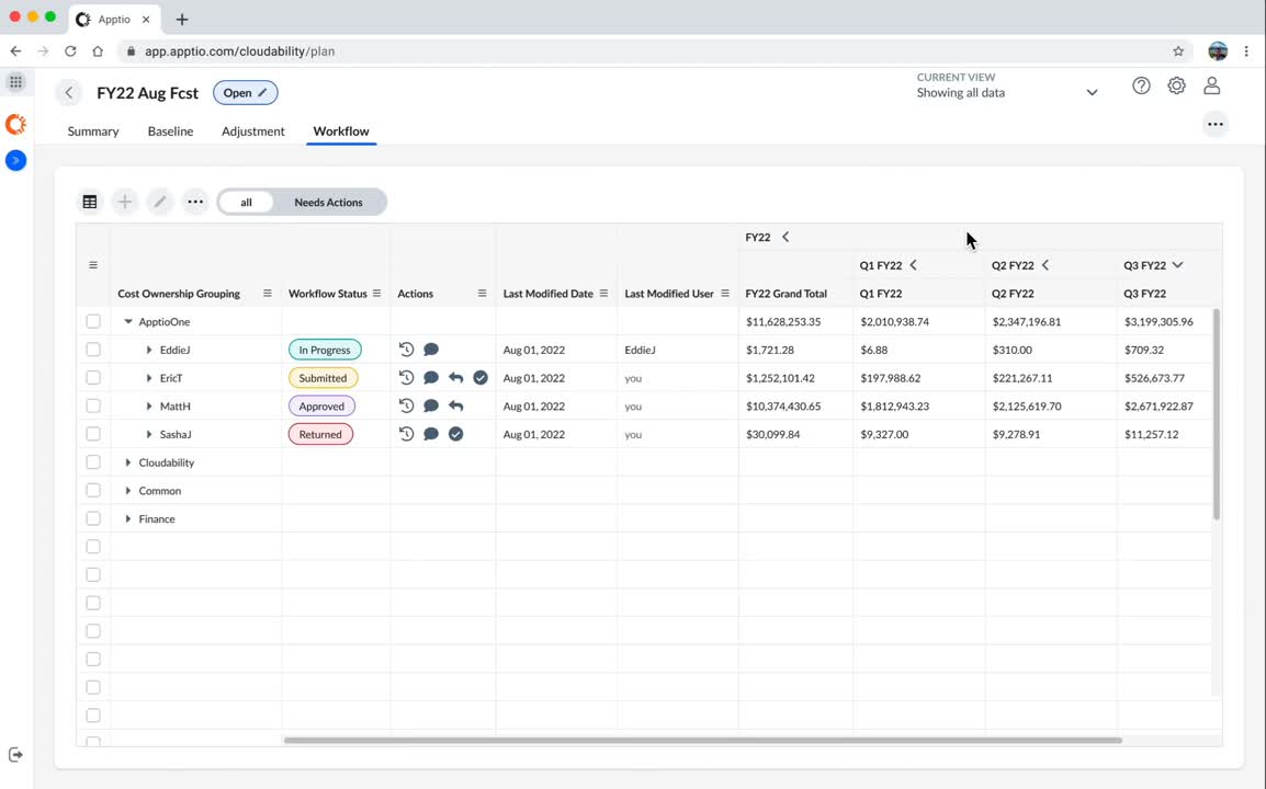
Discussion 4: Workflow
* Click the images to read the details

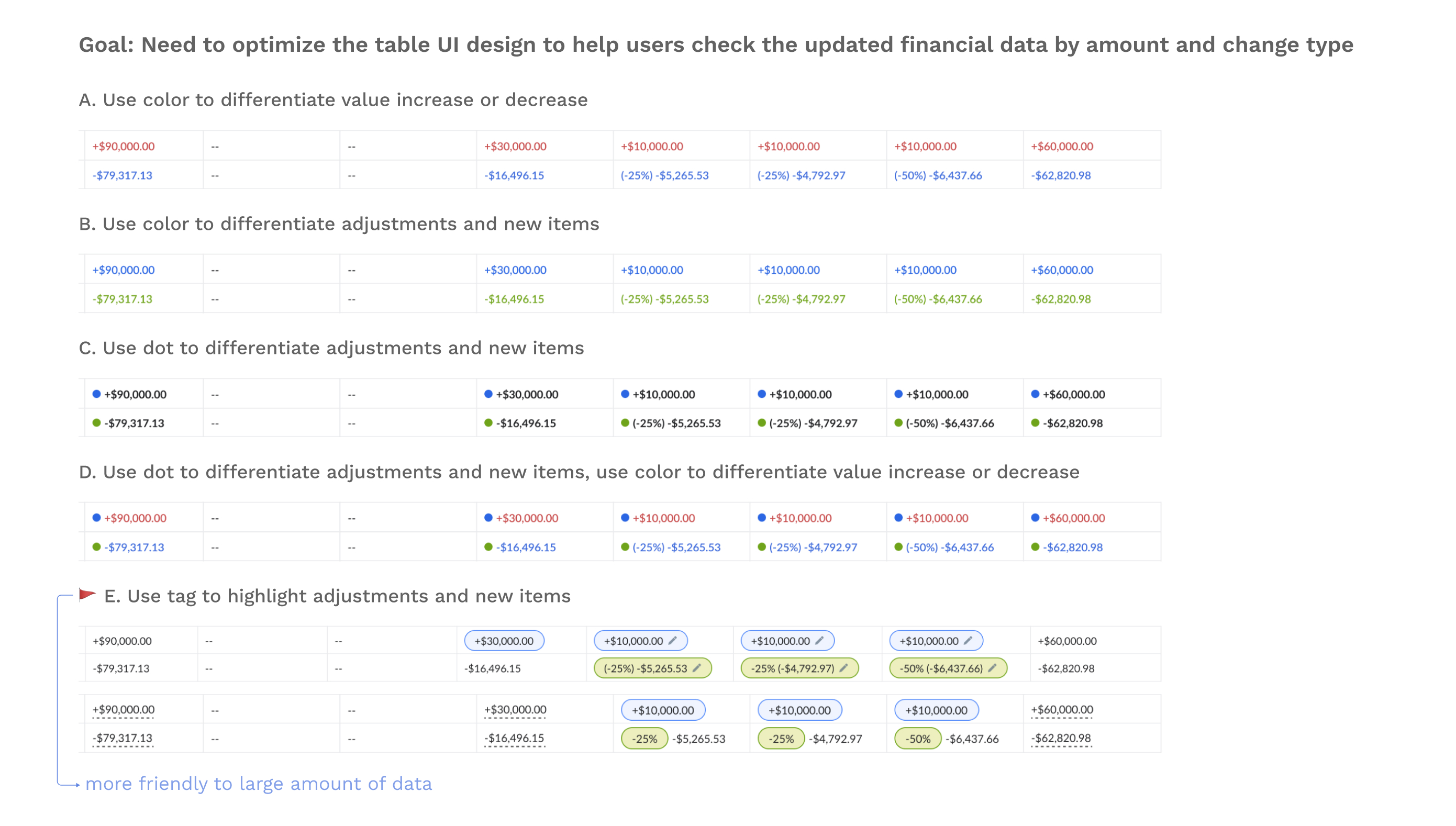
Discussion 5: Table UI
* Click the images to read the details
1. Better Data Collaboration Experience

Old Design: Approving submitted data change

New Design: Approving submitted data change
- ⚠️ In ITP, Ops take 5 steps to notice data updates and make responses
- ✅ Collaborative functions all on the table or modals, avoiding 3+ page loadings
- ✅ Collaboration status classified with color chips
Old Design: Entering and submitting data change

New Design: Entering and submitting data change

- ⚠️ In ITP, the data table is small and flat, and finding submitted changes is hard
- ✅ Larger table, adjustment types and data in color chips, and hover to see summarization in a tooltip
- ⚠️ In ITP, enter and submit data change in a modal, so can't see the influence on other lines
- ✅ "Calculator" view during edit, upper / lower line number change correspondingly
Old Design: Plan Menu

New Design: Plan Menu

- ⚠️ In ITP, users scroll through a flat list of plans
- ✅ Direct dive into plans, knowing the number of to-dos and related plan details
2. Better Management Experience

Old Design: Plan Settings separated on different pages
New Design: The "manage-all" drop down

- ⚠️ In ITP, Plan Admins switch plan in summary, and manage Status / permission / line items on 3 separate pages
- ✅ All plan settings organized into the drop-down, and opened in modals
User Testing
In the final step, I conducted a moderated pilot user test guided by the Design Lead on an internal user who, to help evaluate our design solutions.
The test found that:
Successfully completed 6/7 collaboration tasks
User efficiency increased by 25% in the task of approving submitted adjustments
Next Steps
Keep improving the information presentation on the data table; Conduct card sorting research to truly understand what prioritized information they work with
Add accessibility to the table design (i.e., hover to explain action icons)
Consider complicated data tuning use cases: when Devs and Ops submit and reject for several rounds, how do we help them keep track of the history
Consider how the Summary, Adjustment, and Workflow can be further combined to simplify user flow
The 3-month work experience was a very valuable learning experience for me. I step further than the expectation for a Design Intern. I am glad that my design was brought to life at the end and brought profound influence to the product demo at the conference.
Besides CFP, I also complemented the Apex Design System by creating a design system documentation to help standardize a UI use cases about switchers across 7 Apptio products.

What I learned:
Prioritize user tasks
Design flows and prototypes allow users to complete their tasks with the fewest clicks and loadingsChallenges can be opportunities
Limited page numbers can be the opportunity to revamp the user flowCommunicate to PM with sketches
Present the content they want but can't vision in the language they can understand